

The Coffee Society branding
Branding / Packaging design / Typography
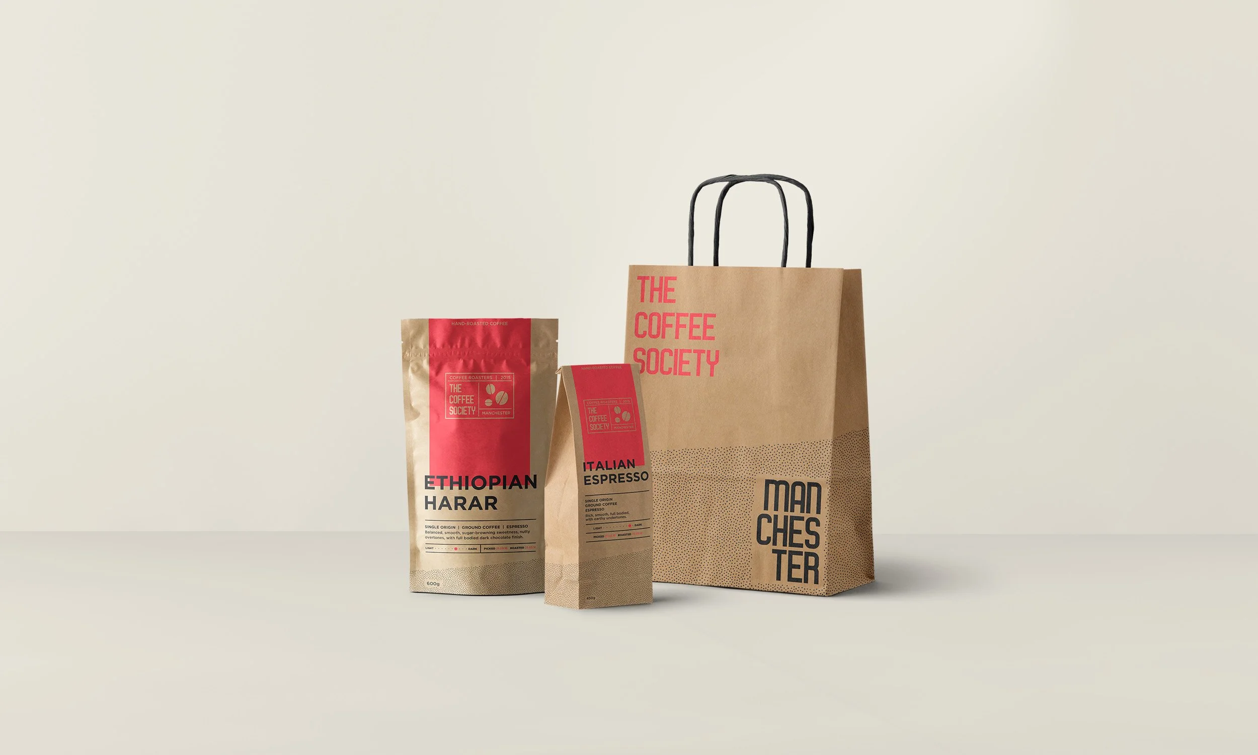
Contemporary design concepts for an independent coffee roaster. Bold typography and colours combined with natural patterns give the brand some oomph to match their delicious coffee.
Using minimal colours & layouts that maximise white space keeps the messaging clear and maintains the contemporary look & feel of the branding. The natural pattern symbolises coffee grounds and it flows through the packaging and website. As well as adding character, it gives a subtle nod towards the eco-conscious values.