

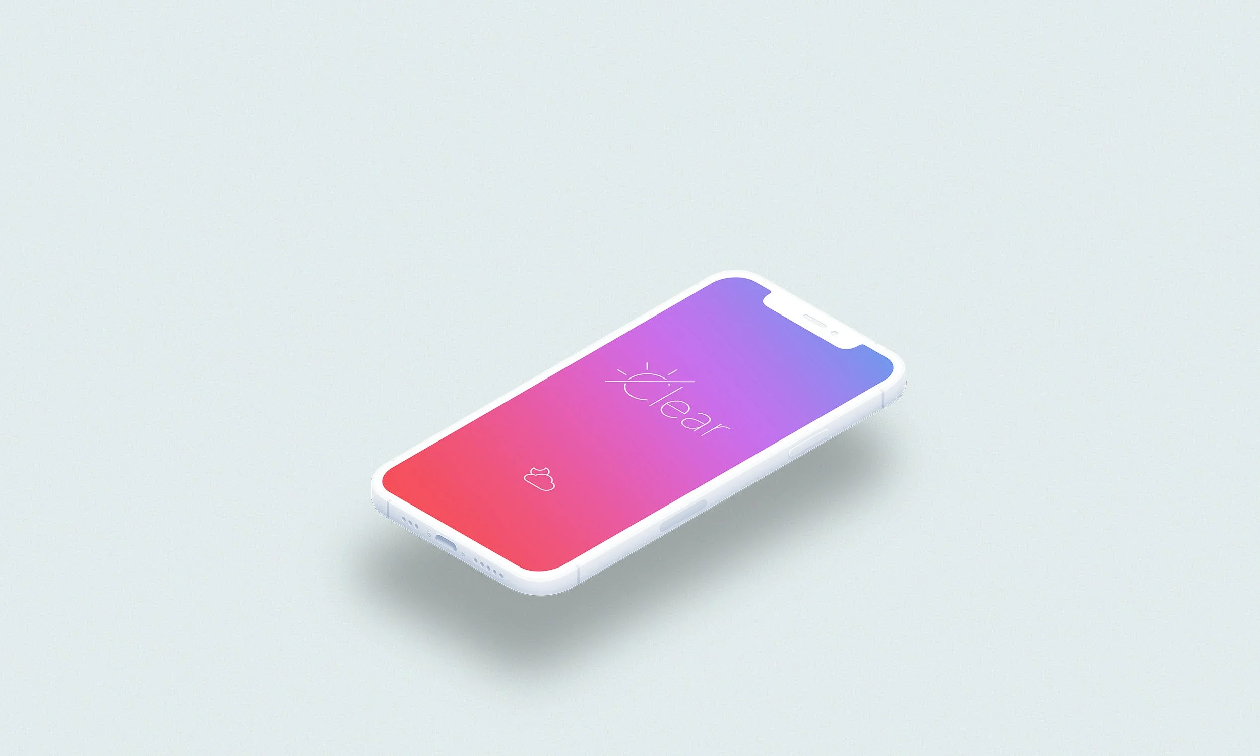
Clear weather app & branding
UI design / Branding
The design celebrates the colours of the weather and displays key information with a minimal & clear approach. I took inspiration from dramatic skies and created a set of gradients to reflect the current weather conditions.
After carrying out research to identify the core weather stats, it was apparent that the current conditions (temperature especially), were the highest priority, closely followed by the coming days, and then the rest of the current day. By filtering out some of the more niche info, I was able to create a super clear interface that allowed the gradient elements to shine through.